Data Visualization — Guide for Data Engineers
Overview
Data Engineers mainly focus on building data pipelines by performing ETL/ELT from various source systems ,data modeling ,data validations and data governance. As a data engineer ,having a good sense of data visualization knowledge will definitely help during the process of defining the business metrics ,gathering the required data from the source systems and to model the data into a DW system.
In this article I will cover the basics of data visualization and discuss about various charts used in the dashboards.
What is Data Visualization?
Data visualization is the presentation of data in a pictorial or graphical format to communicate the results to the users. Data in the tabular format can be useful for data analysis ,debugging and exploration but visualization excels when summarized data is represented in the pictorial format.Below are some of the benefits of visualization.
- Pattern Analysis
- Easy for Comparisons
- Identify problems in the data
- Identify Trends and Correlation
- Discover new information
Data Visualization Categories
Data visualization to represent any type of data in the any reporting tool will fall into one of the below categories.
1. Comparison
Compare similar type of data side by side or over time.
- Bar Chart
- Column Chart
- Line Chart
- Pie chart
2. Composition
To represent how individual parts make up the whole of something, such as the device type used for mobile visitors to your website or total sales broken down by sales rep.
- Pie chart
- Stacked Bar
- Stacked Column
- Stacked Area chart
- Waterfall chart
3.Relationship
To represent how one variable relates to one or numerous different variables.Helps to identify relationship between two or more values.
- Scatter plot
- Bubble chart
- Line chart
4. Distribution of data
To represent the distribution of data to understand outliers and the range of values in the data.
- Histogram
- Scatter plot
- Line chart
- Bubble Size chart
5. Maps — Representation using geo spatial data
Map visualization is used to analyze and display the geographically related data .
Same chart type can be used to represent data from multiple categories. ie (Bar chart can be used for both comparison and composition)
Types of Charts
Below are some of important types of charts used in business analytics reporting.
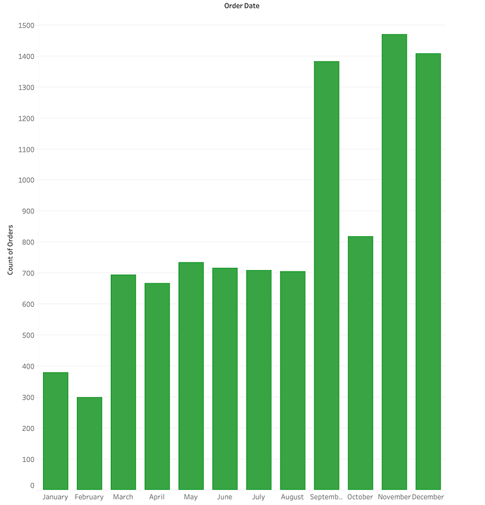
1. Column Chart
A column chart is used to show a comparison among different items, or it can show a comparison of items over time.
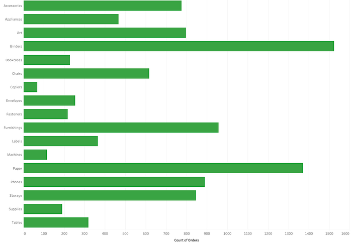
2. Bar Graph
Bar graph is the horizontal column chart mainly used to compare categories if the number of values are more than 10. The values in the bar graph can be both positive and negative. Bar graph provide a initiative way to compare categories of data.
3. Line Graph
Line graph is used for visual representations over time. The dataset used in the line graph is continuous.

4. Histogram
A histogram is a chart that groups numeric data into bins, displaying the bins as segmented columns. Histograms are mainly used to represent distribution of dataset. The data represented in histogram is continuous.
Histograms visualize quantitative data or numerical data, whereas bar charts display categorical variable.In a histogram chart there will not be any gaps between the bars whereas in a bar chart there will be a space.

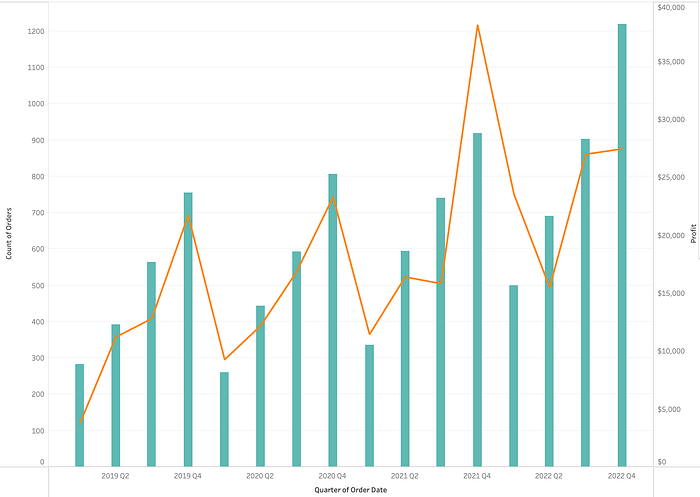
5. Dual Axis
Dual Axis graph is used when there are two or more measures. This type of graph uses two y-axis and shared x-axis. It is mainly used to represent correlations between three datasets.
6. Area Chart
An area chart is a line chart filled with a color or pattern in the space between the x-axis and the line. is It is useful for showing part-to-whole relations.

7. Stacked Bar
Stacked bar chart is used to compare items and also display the composition of each item.

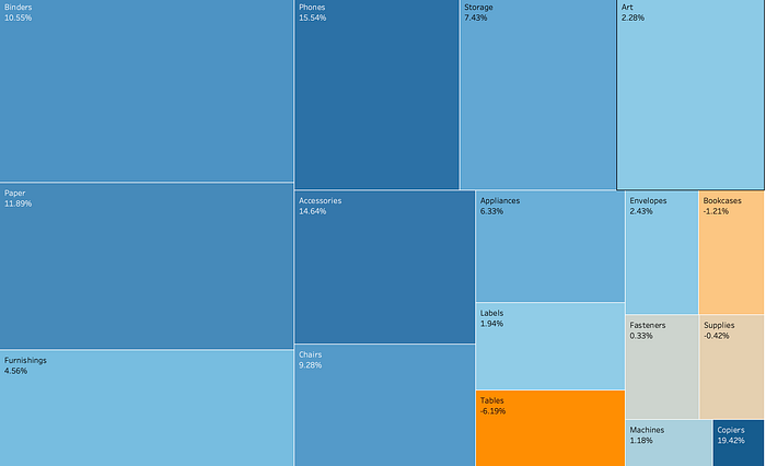
8. TreeMaps Chart
Treemaps are an alternative way of visualizing the hierarchical structure displaying quantities for each category via area size. Each category is assigned a rectangle area with measures inside it.
9. Pie Chart
A pie chart is a circular statistical graphic, which is divided into slices to represent numerical proportion.

10. Table Chart
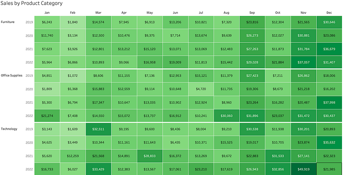
Table chart displays the actual values of each category. These type of visuals are used in the drilled down version of the dashboard.
11. Maps
Map visualization is used to analyze and display the geographically related data and present it in the form of maps. Maps in dashboards are initiative to display metrics by location.

Some of other type of charts
- Bubble Plots — To represent 2 or more metrics across multiple dimensions.
- Waterfall charts — To represent a running total which has a initial value and delta. It can be both positive or negative.
- Gauge charts — single value within a quantitative context.
- Funnel charts — To represent a progress of a multistep process. Eg.Conversion rate,Sales progress.
Thanks for reading!
